Is There a Science Behind Good Billboards?
We see billboards, signs, and advertisements on the go every single day - but what separates the memorable from the forgotten?
I’ve traveled to New York about twenty or so times in my life.
There are the usual suspects that make up a good weekend in Manhattan: Broadway shows, rooftop drinks, street musicians, raclette cheese in the East Village.
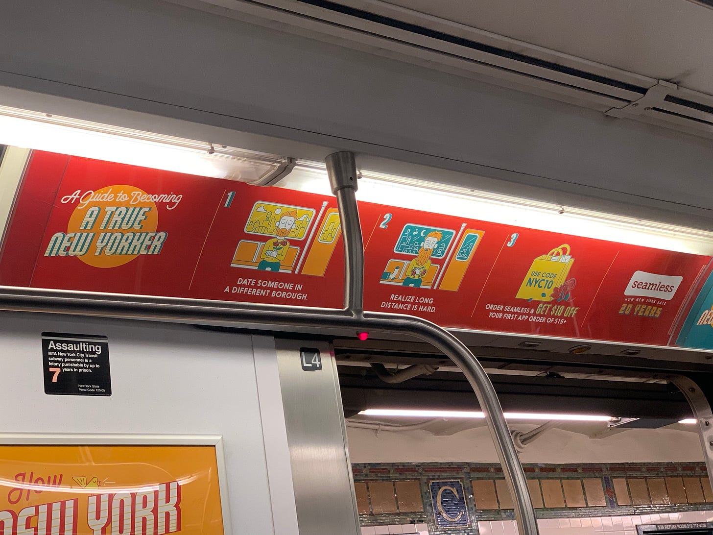
But, since I’ve started to work in marketing, there’s another dimension of life in the city that has fascinated me: The artful subway ads.
At a macro-level, the subway ads tell the evolving story of a city in a few words.
I can visit New York after a year, hop onto the A train, and generally learn what brands want New Yorkers to care about at the moment.
It’s a hotbed of everything that plagues the existentially frustrated urbanite. Notices about dating, moving troubles, finance, healthcare, selling commodities and much more.
During COVID, it was easy to see a city on the verge of apprehension surrounded by reminders of it everywhere. Notices of mask, safety regulations, and hygiene colored the train ceilings.
Take into consideration this as well: the average commute time for New Yorkers using the MTA is 53 minutes. One of the longest commutes in America. It’s one of the most fertile advertising grounds in the country.
You might naturally presume this would lead to a better advertising opportunity. The more time you have with someone sitting idle, the higher the likelihood they would see your ad right?
Perhaps, but it’s probably the opposite. When people know they have a certain amount of time, they will plan around it. Books, writing, podcasts, whatever fills the void.
In some ways, the best subway ads transcend traditional advertising. More than a product of basic advertising, it’s an art form to bring the typically distracted New Yorker from their phone into a trance that makes them privy to their own problems.
Sitting on those trains got me curious in general about the world of subway ads, and by extension, advertising structures in high-traffic areas. Billboards, park benches, buses, and more.
While we don’t think twice about regulatory signs we see on the road, we tend to ignore most everything else. It’s a fundamental maxim of marketing that most people hate being advertising to.
It’s a world of abundant eyes and short memories.
So how do the best survive?
I wanted to get deeper into the world of outdoor advertising by starting with the opposite question - not why the best survive, but why most barely register in our psyche.
Why Are Most Signs Ignored?
The answer might initially seem obvious. We have short attention spans and need information quickly. Insert stat from Forbes about how millennials are just gerbils with complex brains!
But there are also signs that can have a 100% capture rate, regardless of what information goes in them. While you do want something to be compelling, where you put it almost matters more.
A couple weeks back, on the recommendation of my friend Sam Klein, I picked up a book by environmental psychologist Paco Underhill called Why We Buy.
It’s a fascinating read on the science of retail shopping where he talks about the influence of gender, the senses, the environment and much more in shopping decisions.
Underhill spends an entire chapter talking about the nature of signs, where he shares an interesting primer:
17 percent notice a sign exists
12 percent bother to read the sign
The average viewing time is 2.9 seconds
These stats begin to form the premise of both this chapter and Underhill’s work in environmental psychology: a good way of knowing if something will be successful is by observation.
There’s lots of advice that can lead to beautifully designed signs. If you looked at some of the best signs in the world, there are certainly patterns that characterize resonant typeface, colors, layouts and copy.
But, this is where bias kicks in.
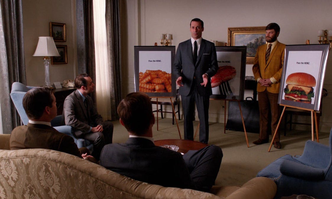
Most of these are presented in a conference room, where there are no distractions from lighting, climate, or even the task at hand. If a group of ad creatives is presenting to a client, the client’s entire objective is to evaluate the power of this single sign. Think Don Draper spitting his game.
Underhill emphasizes why this is bad:
I attempt to remind everybody that people in stores or restaurants or banks are almost never still; they’re moving from one place to another. And they’re not intent on looking at signs or flat screens—in fact, they’re usually doing something else entirely, like trying to find socks, or seeing which line is shortest, or deciding whether to have the burger or the chicken.
This brings up two key points to consider about ourselves.
One point is environmental disparity in evaluating marketing assets.
In Thinking Fast and Slow, Daniel Kahneman talks about how our decision-making is broken down into two main systems:
System one is fast and operates automatically.
System two is slow, allocating attention to effortful mental activities.
If we think about the above example of creatives in the conference room, it’s hard to imagine that they are evaluating the sign with the same system that consumers are reviewing it in. Even in a focus group, if people like the sign, it doesn’t consider the same constraints of a natural environment.
The other point is behavioral disparity in evaluating marketing assets.
In the chapter, Underhill talks about an interesting example of a large bank, which had a shelf containing brochures on money market funds, car loans, and more.
It was largely ignored.
But when Underhill was called to consult on it, the answer seemed obvious.
No one is going into a bank to read brochures.
You have a task to perform. It’s why you’re going into a bank in the first place. It’s the same as going to a pharmacy. Same as going to a post office. You’re rarely going for fun.
Underhill refers to this as task-oriented behavior. If a customer is going into a store set on a specific task, it will be hard for them to slow down and read anything until a mission is accomplished.
This is, again, very hard to evaluate in a climate-controlled conference room. Your only mission is to decide whether the copy and creative is good, ignoring all the potential barriers that would prevent the average person from doing so.
To illustrate this with another example, I was at a workshop for my day job a few months back where we had a brainstorming session for new direct mailers.
The prompt was a bit unconventional: From the opening of the mailbox, you have to get someone to open your mailer and complete your ask in ten minutes.
Yikes.
While it is naturally unreasonable to expect anyone to open the mail and complete an ask immediately, introducing the constraints brought up a new question: what are all the things that can stop someone from opening your mailer and completing your ask? What are all the tasks they have in that very moment, that do not involve opening mail?
Perhaps they throw it on the kitchen table and go to feed the cat. Perhaps they leave it on the front seat of the car for a regular clean out every two months. Even if they do open the mail, maybe they’re just scrambling to go through all of them to get it over with.
Understanding the portfolio of potential tasks helped us think about ways to innovate on a mailer. Even something as simple as a colored envelope (Elle woods resume, anyone?) or metallic stickers were easy ways to cut through the noise.
But if the post office, banks, and pharmacies are problems, think about the mammoth challenge for billboards.
The task of your audience is to drive. Unless you are blessed by a streak of lucky traffic, you have limited time to hook someone in a rush who couldn’t care less.
Is there a better way to think about signs that don’t get ignored?
How Do You Break Through The Noise?
There’s an unconventional placement Underhill loves for signage: the inside of bathroom doors. Think about it.
When you’re on the toilet, there is almost nothing else you can do. It guarantees the sign will be seen and it’s a place where you can really creative with messaging.
Escalators as well. If you’re just rising slowly with nowhere else to go, it’s a perfect place to see a sign.
Underhill’s favorite example comes from lawn mower manufacturing company Toro, who made an in-store video to promote its automatic mulching mower.
It would seem like a natural decision to promote the video in the same section of supply stores where they sold mowers. But, they actually did something different.
The video went into repair department waiting areas. Naturally, everyone who goes into repair areas has to wait and there is like a likelihood that they will someday also buy a mower. Win win!
In a similarly interesting twist of fate, McDonald’s found that 75% of customers read the menu board after they order while they wait for their food. Meal prep takes time and that’s when people who have paid and received change will be reading almost anything.
This is one part of a larger conceptual strategy Underhill proposes: the idea of zones.
Every environment has zones, where people are thinking about different things, focusing their eyes on different things, and even doing different things.
If you map out all the zones of a restaurant, the zone where someone is in line for food could be entirely different than the zone where someone is washing their hands after the bathroom. The zone where someone is getting condiments after they order is different than the zone where they enter the restaurant. Each of those signs require different considerations.
Think about the Subway ads. The ad right next to the map of the Manhattan MTA is probably going to get much more eye room than a random ad at the top. They would and should be zoned differently.
Underhill concludes:
“Thinking that every sign must stand on its own and contain an entire message is not only unimaginative, it’s ignorant of how human brains operate. Little advertising stickers stuck to your apples and pears are either the cleverest thing ever or the most obnoxious defacement of God’s bounty, depending on your point of view.”
While this does help with some strategy, there are some weird exceptions.
For example, what about the billboards?
While billboards are a commonly known medium, they defy a lot of Underhill’s principles around zones. It’s hard to decipher zones when the zone is rather homogenous. How do you distinguish between a bunch of irritated people sitting in traffic?
If you look up simple billboard tips, you might think that less words, succinct communication, clear messaging, and good color contrast are enough to make a billboard stick.
But, it’s tricky. You can’t necessarily put an actionable CTA on a billboard if drivers, cyclists, and bikers would see see your advertising on the go. The goal is more lofty. BM Outdoor suggests in their piece on the psychological impact of outdoor advertising that a billboards main objective is familiarity. To engrain your branding into the consciousness of the public.
To do this requires more than standard copy. It requires something more bold, more enduring. It needs to strike the balance of distraction, curiosity, and excitement.
I live in San Francisco, where the billboards almost becomes this avant-garde streak of messaging to seduce impressionable young techies.
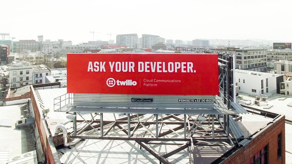
Twilio has a famous one in SF, the Ask Your Developer series. But the billboard is only one part of a larger brand vision for Twilio.
CEO Jeff Lawson, titled his book Ask Your Developer and the words have become a minor rally cry for harnessing the power of software developers and unleashing their full talents. Seeing it over and over again helps that resonate and eventually drives that curiosity.
For younger startups, it can be a magic wand into prevalence.
Alex Krakov, former VP of Marketing at Lattice who wrote a brilliant piece on his experience buying billboards shares an interesting thought:
Billboards make startups feel bigger than they actually are. They make startups feel like a legit company. It might be silly, but many consumers think, “If they can buy a billboard, I’ll consider trusting their product.”
One of my favorites is Spotify, who runs regular billboards around the habits of their listeners and the passing of time.
Lots of people have heard of Spotify and I’m sure many haven’t been directly prompted to download because of the billboards. But they have overall been a net positive for Spotify, leading to a flurry of virality on social media and appreciation for the brand tone.
In the UK, they were even called absolute belters.
I don’t quite know what that means, but I assume from context that it’s good.
Final Thoughts
In all my research with billboards, signs, and ads, there was a common theme: people on the go are susceptible to almost anything.
Unlike the internet, playbill magazines, or any sort of situation where you have a captive audience sitting still, outdoor recruiting is hard. Nobody is planning their life around looking at billboards for fun.
But if we look at Underhill’s research and the psychology of billboards, we see there are often two paths: Remove the distraction or increase the consciousness.
If I was to redesign subway ads, it could be interesting to experiment knowing what we know.
Maybe it’s an ad to listen to a podcast or audio note, which we know lots of commuters are already doing. Maybe it’s a note to text something on a phone, which we know a lot of commuters already have. Maybe it’s just empathy around why it’s frustrating that the Red Sox are better than the Yankees, which we know New Yorkers need right now. (Source: MLB Standings.)
The latter wouldn’t necessarily remove a distraction - but it might just get New Yorkers mad enough to stay on top of the city’s consciousness.


Another brilliant post - this one hitting especially close to home for me. Nothing better than a great subway campaign that makes me laugh and keeps my focus off the long commute. Thanks for the s/o!
V Good post Kushaan.